
In the world of web design, responsiveness is no longer a luxury but a necessity. With the proliferation of digital devices sporting various screen sizes, providing a seamless user experience across all these devices can be a complex task. This is where the concept of responsive design and CSS media queries come into play, especially when focusing on a “mobile-first” approach.
What is the Mobile-First Approach?
The mobile-first approach is a development strategy where the design for smaller screens (like mobile devices) is created first and then adapted for larger screens. It is based on the idea of progressive enhancement, which starts by providing a core experience for the lowest specification of the device, and then enhances the experience for more capable or larger devices.
My colleagues from work, most frontenders, prefer to start with the mobile resolution and then go up. They believe that this helps to ensure that the website is optimized for the smallest screen size, which is important for accessibility and performance.
This approach is highly recommended due to the growing mobile user base. Google also gives preference to mobile-optimized sites in its search results, making this an SEO-friendly approach.
Utilizing CSS Media Queries
CSS media queries form the backbone of any responsive design. They allow the application of CSS rules depending on certain conditions, most commonly the width of the device’s viewport.
In a mobile-first approach, media queries are generally used to adjust the layout and aesthetics of a webpage as the screen size increases. Let’s explore some common breakpoints that developers may consider:
/* Styles for mobile devices */
@media only screen and (max-width: 600px) {...}

/* Styles for portrait tablets and large phones */
@media only screen and (min-width: 601px) {...}

/* Styles for landscape tablets, small laptops */
@media only screen and (min-width: 769px) {...}

/* Styles for laptops, desktops */
@media only screen and (min-width: 993px) {...}

/* Styles for large laptops and desktops */
@media only screen and (min-width: 1200px) {...}
It’s important to note that these are just general guidelines. The actual breakpoints should be determined by the content and design of your website. Also, don’t forget to include the viewport meta tag in your HTML to ensure proper scaling on all devices:
<meta name="viewport" content="width=device-width, initial-scale=1">
To Wrap Up
Responsive design with a mobile-first approach is all about improving the user experience. Using CSS media queries strategically, you can craft websites that look and function well across various devices. However, as with any tool, the key to effective use is understanding your content and your users. The best practices enable your users to interact with your website seamlessly, regardless of the device they use.
One of the best sources related to CSS is this site
https://css-tricks.com/a-complete-guide-to-css-media-queries/
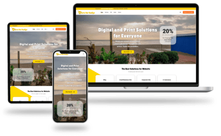
Check some of my Web Projects that use WordPress and responsive themes
Views: 42